
MDCP 102 – CSS Columns – Design Strategies – Version Control
April 1, 2024 9:51 pm Leave your thoughtsCSS Columns
So far we have seen the ease of use with CSS Grid and flexbox. With these tools we can take elements and easily deploy them into content in a way that any new element that is added will be added as a new item with ease of use and management. These tools are great for both dynamic and static content whenever new content is to be added, both of these tools take the guesswork out of the equation. There are some further tools we can use to mitigate content within containers to keep things neat if and when needed.
One of those tools we can use is CSS columns. Where Grid is used for layouts or bigger parts of the page and flexbox is used for more 1 dimensional content going either across the page or down the page, CSS columns are used in a simpler way. This method takes a div and just splits it up into columns. This is different from Flexbox in the sense that flexbox deploys flex items (any elements that are in the flex parent) whereas CSS columns just takes the content within the div and splits it up without having child div elements.
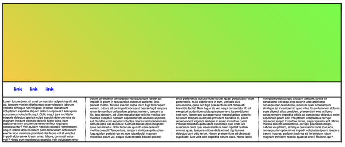
To use this, we can simply create a div and in the CSS tell it:
columns: 4;The columns property will split the div into the amount of columns we tell it to. There are extra things we can add to this.
column-width: 300px;
This can be used in place of a number of columns. It will set the column to a set size and make every column the same.
column-gap: 50px;
This will add space between the columns.
column-rule-style: solid | dotted | dashed | double | inset | outset | groove | none
This will add a border between the columns.
column-rule-width: 5px;
This will change the size of the border between the columns.
column-rule-color: chartreuse;
This will change the color of the border between the columns.
column-rule: 5px dashed chartreuse;
This is the shorthand form of width, style, and color.
column-span: none | all | initial | inherit
This will span an element within the div over the columns.
Design Strategies & Traditional Layouts

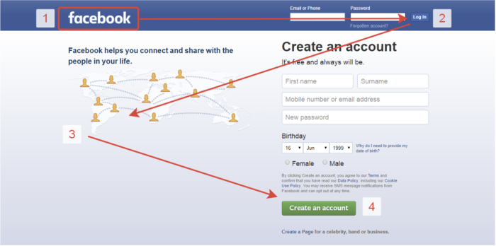
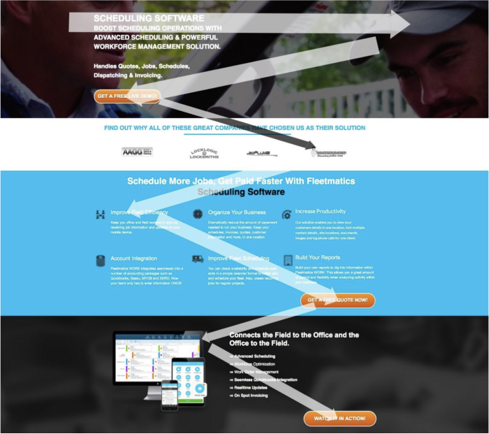
There are generally 2 ways humans will scan a page. Which way will depend on the content. When people are reading large blocks of text they will follow an F-pattern. When scanning a more design-heavy page with less text it will be a Z-pattern.
F-Pattern


Z-Pattern

Website Management & Versioning Control
Version Control AKA Revision Control
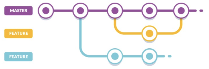
When generating HTML web pages, you will need to keep track of the versioning. Versioning control in a nutshell is a way of keeping track of the changes made to a file or a set of files (like a whole project) over time. This can allow a developer to go back and get files from older versions if they need to. There are tools to help do this (like GitHub) but this can also be done on your own.
A simple example of this would be the practice of duplicating a project’s folder every time you want to add a new feature or make a significant change to the project. This way, if for any reason you need to go back to an older version you can easily do so. (An example is if you make a change and the client does not like it and wants to revert back, you have the copy of it from before the change and all you have to do is re-upload the old version).

CMS Systems
When you first start learning web development, you learn the basics such as HTML, CSS, elements (the building blocks of HTML pages), how to generate HTML pages and so on. This is all well and good to use if you want to keep a simple site and don’t mind doing the extra work of maintaining HTML the old school way.
The thing is, most sites on the web do not work this way. Most sites on the web are using some form of CMS system. If you have a client that wants a new website, chances are they want a CMS system and rightly so. With a CMS system, anyone can update, add, delete or move around content to the site without knowing how to code. CMS systems allow clients to focus on what it is they do (their own business) whilst streamlining the workflow of maintaining a website. It also is cheaper to run in the long run depending on what it is they are doing.
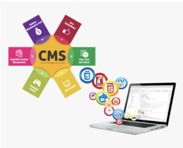
Similar to how you update a profile or account on social media. Social media platforms are essentially content management systems built for the masses to use.
There are different levels of CMS systems:
- Small, simple and basic home-made content management that can generate content within an HTML template.
- Medium to larger style (and in many cases open source) CMS systems that can accommodate small businesses all the way up to large corporate entities. This can include blogs/articles, e-commerce, archived content, networked content, social media platforms and more.
- Enterprise solution (also in many cases built on open source) CMS systems that can be networked or geared to very large scale applications.
- And everything in between.
Web Ready Images
File Formats
When preparing images for the web, you will want to use either jpg, jpeg, gif, or png.
- JPG and JPEG are best for photos
- PNG is best for vectors
- GIF is best for animated images and simple drawings
Optimize File
You MUST size your file. You do not want to use a 3000px X 4500px image for some small content image. Images need to load and when the computer downloads an image it does it pixel by pixel, line by line. A bigger image means a bigger file size which means longer download time. Scaling down image sizes and file sizes to fit where they need to be will cut down on loading time.
File Names
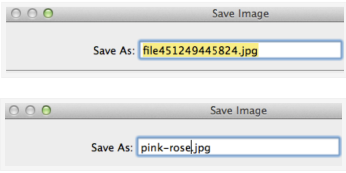
Keep image files in an /img folder. Also, name the files in a neat and easy way. Do not have long file names. If you download images off a Google search and get a long string of numbers and letters as a file name, rename it.
Background Images
There are 2 ways images are commonly loaded: through the HTML or through the CSS. When we load the image in CSS we can do it as a background image.
Any container can have a background image. It does not matter what it is.
.element {
  background-image: url(path-to-file/image.jpg);
}
After the image is loaded we can manipulate it in some ways.
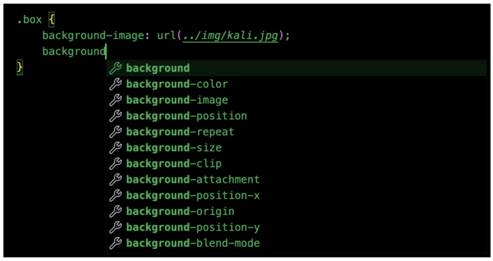
- Background-position: We can control the position of the background image.
- Background-color: We can put a background color under the background image.
- Background-repeat: We can control if we want the background image to repeat as a pattern or not.
- Background-size: We can control the size of the background image.
- Background-clip: Controls how the background is clipped. https://developer.mozilla.org/en-US/docs/Web/CSS/background-clip
- Background-attachment: With this we can control how the background image will behave. For example if we want it to scroll with the page or stay fixed.
- Background-blend-mode: We can change the color blend mode for the image and the color under the image.
*LINKS!!!!***
file:///Users/username/Desktop/Week3/index.html
Do not submit links like this. A link like this is a link to a file on your computer which cannot be accessed by outside computers.
You must submit an HTTP link:
http://somesite.com/assignment1
Categorised in: Lectures, MDCP 102
This post was written by amax