
WEBD 150 – CSS Grid
April 4, 2024 1:34 pm Leave your thoughtsCSS Grid Layout: A Comprehensive Guide
CSS Grid is a powerful layout system that allows developers to create complex, responsive web designs with ease. Unlike Flexbox, which is one-dimensional, CSS Grid provides two-dimensional control over both rows and columns, making it perfect for overall page layouts and complex components.
Introduction to CSS Grid
CSS Grid is an easy way to deploy content. CSS Grid provides us with a 2-dimensional way to display content allowing us to deploy both columns and rows. Within the grid we can display any content we wish and design it how we want. Sort of like a table but better. We can use them for website components or even entire website layouts, they can be used on web pages or web apps. At first it may seem confusing to look at but after checking out the code and seeing what makes it tick, it will seem easier. In this lesson we will look through it and break it down.
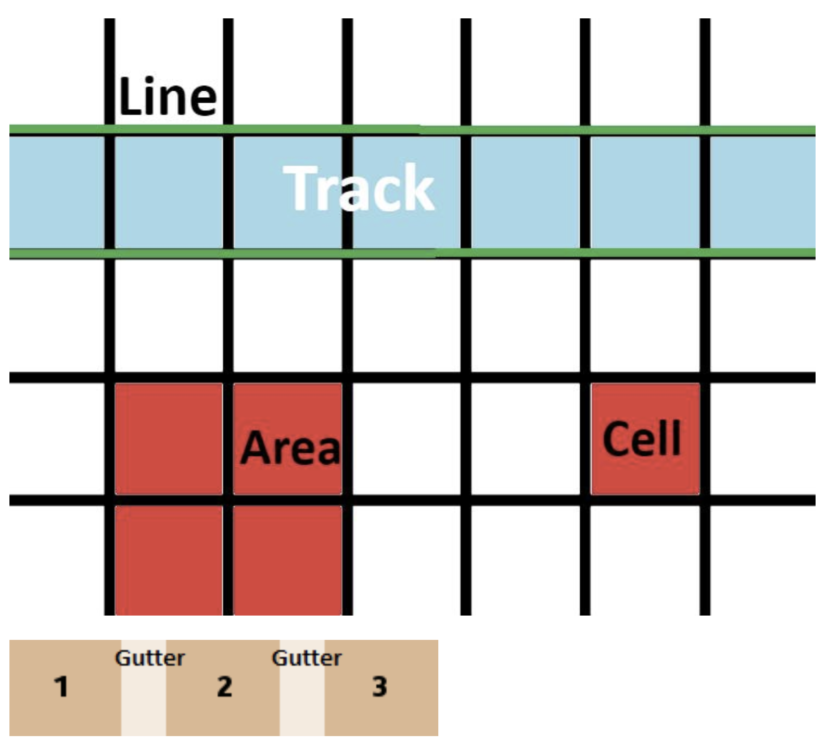
Basic Terminology
Let’s cover some basic terminology before jumping into code samples. If you’re familiar with Excel, the Grid terminology is fairly easy to understand.
- Grid: Any element with the display property set to grid. This declares the grid.
- Line: Horizontal and vertical lines that define boundaries.
- Cells: Space between 4 grid lines.
- Tracks: The space between two parallel lines.
- Gutter: Space between cells.
- Area: The area between 4 grid lines. This can have any number of cells.
Browser Compatibility
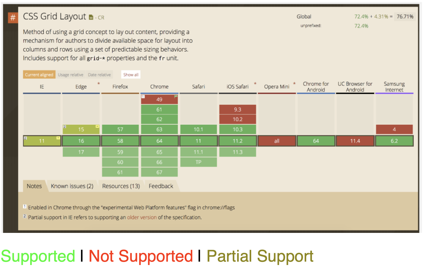
| Browser | Support Status | Notes |
|---|---|---|
| Chrome | Supported | Version 57+ |
| Firefox | Supported | Version 52+ |
| Safari | Supported | Version 10.1+ |
| Edge | Supported | Version 16+ |
| Internet Explorer | Partial Support | IE10-11 support older syntax with -ms- prefix |
Getting Started with CSS Grid
In the HTML we have to create the structure of the grid. A Parent element which will be the grid container and some children elements which will be the grid items:
A Basic Grid Example
Here’s a complete example of a responsive image gallery using CSS Grid:
HTML Structure
            <div class="grid">

                <div class="grid">
                    <img src="image1.jpg" alt="Description">
                </div>

                <div class="card">
                    <img src="image2.jpg" alt="Description">
                </div>

                <div class="card">
                    <img src="image2.jpg" alt="Description">
                </div>

                <div class="card">
                    <img src="image2.jpg" alt="Description">
                </div>

                <div class="card">
                    <img src="image2.jpg" alt="Description">
                </div>

                <div class="card">
                    <img src="image2.jpg" alt="Description">
                </div>

                <div class="card">
                    <img src="image2.jpg" alt="Description">
                </div>

                <div class="card">
                    <img src="image2.jpg" alt="Description">
                </div>

            <!-- More grid items could go here if you need more -->
            </div>


            * note the use of a class on each grid item (IE <div class="card">) is optional. I personally would not do this and instead use the nth:child selector in CSS to select and edit any particular child or children. Like this:


            <div class="grid">

                <div>
                    <img src="image1.jpg" alt="Description">
                </div>

                <div>
                    <img src="image2.jpg" alt="Description">
                </div>

                <div>
                    <img src="image2.jpg" alt="Description">
                </div>

                <div>
                    <img src="image2.jpg" alt="Description">
                </div>

                <div>
                    <img src="image2.jpg" alt="Description">
                </div>

                <div>
                    <img src="image2.jpg" alt="Description">
                </div>

                <div>
                    <img src="image2.jpg" alt="Description">
                </div>

                <div>
                    <img src="image2.jpg" alt="Description">
                </div>

            </div>
To create the grid in CSS, we start by setting an element’s display property to grid:
.grid {
        display: grid;
    }
Once we do this, all the child elements of our .grid container become grid items. However, without further instructions, they’ll simply stack vertically.
Adding Columns
To define columns, we use the grid-template-columns property:
.grid {
        display: grid;
        grid-template-columns: 1fr 1fr 1fr;
    }
This creates a grid with three equal-width columns. No matter how many child elements we add to our .grid container, they will follow the 3-column pattern we’ve established.
Fractional Units (fr)
In CSS Grid, although you can use px, % or em values, it’s recommended to use fr (fractional units). The fractional unit represents a fraction of the available space in the grid container.
In the example grid-template-columns: 1fr 1fr 1fr;, each column gets 1 fraction of the available space. If we wanted the first column to be twice as wide as the others, we could write: grid-template-columns: 2fr 1fr 1fr;
Spanning Grid Items
We can make grid items span across multiple columns or rows using the grid-column and grid-row properties:
/* Make the 1st grid item span 2 rows and 2 columns */


        .card:nth-child(1) {
        grid-column: span 2;
        grid-row: span 2;
        }
Dealing with images in the grid item
If you use an img tag in the grid item, you can make it make it fit in the grid item. Note the CSS below:
            /* CSS Styling */
            .grid {
                display: grid;
                grid-template-columns: 1fr 1fr;
                grid-template-rows: 200px 200px;
            }

            .grid div:nth-child(1); {
                background-color: #1abcb7;
            }

            .grid div:nth-child(2); {
                background-color: #1a3dbc;;
            }

            .grid div:nth-child(2); {
                background-color: #1fbc1a;;
            }

            .grid div:nth-child(2); {
                background-color: #bc1a1a;;
            }

            .grid div:nth-child(1) img {
                object-fit: cover;
            }
Grid Template Areas
You can make whole layouts using grid template areas
If we make a wrapper, we can use that to make the grid and define the grid template areas within.
Step-by-Step: Creating a Layout with Template Areas
- Define your HTML structure with elements for each section of your layout. (Like wrapper and then inside > header, nav, main, footer)
- Set the container to
display: grid. - Define your grid structure using
grid-template-areas. - Assign each child element to an area using
grid-area.
Example: Complete Page Layout
/* HTML */
    <div class="wrapper">
        <header class="header">Header</header>
        <nav class="nav">Navigation</nav>
        <main class="main">Main Content</main>
        <footer class="footer">Footer</footer>
    </div>

/* CSS */
.wrapper {
    display: grid;
    grid-template-columns: repeat(6, 1fr);
    grid-template-areas:
    "header header header header header header"
    "nav nav nav nav nav nav"
    ". main main main main ." /* the . makes an empty grid cell */
    "footer footer footer footer footer footer";
}

.header {
    grid-area: header;
}

.nav {
    grid-area: nav;
}

.main {
    grid-area: main;
}

.footer {
    grid-area: footer;
}
Header
This is the main content
CSS Grid makes it easy to create responsive layouts like this one. The main content area is centered with margins on larger screens but will stack vertically on mobile devices.
Conclusion
CSS Grid is a powerful layout tool that gives web developers unprecedented control over their designs. With its two-dimensional capabilities and intuitive syntax, it’s perfect for creating everything from simple components to complex, responsive page layouts. Start experimenting with CSS Grid to build more flexible, maintainable, and visually appealing websites.
Key Takeaways:
- CSS Grid provides two-dimensional layout control (rows and columns)
- Use fractional units (fr) for flexible, responsive grids
- Grid template areas offer a visual way to define layouts
- Browser support is excellent in modern browsers
- Combine with Flexbox for even more layout possibilities
Categorised in: Lectures, Portfolio, WEBD 150
This post was written by amax